);mask-image:url(data:image/svg+xml;utf8, );content:"";margin:0 .4rem;display:inline-block;vertical-align:middle;line-height:1}.breadcrumb-trail .trail-items li:last-child:after{display:none}.bloghash-breadcrumbs{font-size:1.4rem;border-width:0}#page .page-header .bloghash-breadcrumbs a>span{color:inherit}#bloghash-scroll-top{-webkit-box-align:center;-ms-flex-align:center;align-items:center;-webkit-box-pack:center;-ms-flex-pack:center;justify-content:center;position:fixed;bottom:2.5rem;right:2rem;z-index:997;width:4rem;height:4rem;opacity:0;-webkit-transform:translate3d(0,3rem,0);transform:translate3d(0,3rem,0)}#bloghash-scroll-top .bloghash-scroll-icon{overflow:hidden;z-index:2}#bloghash-scroll-top .bloghash-icon{-webkit-box-align:center;-ms-flex-align:center;align-items:center;-webkit-box-pack:center;-ms-flex-pack:center;justify-content:center;height:2rem;color:var(--bloghash-white);-webkit-transform:translateY(1.1rem);-ms-transform:translateY(1.1rem);transform:translateY(1.1rem)}#bloghash-scroll-top:before{content:"";z-index:1;border-radius:10rem;background-color:var(--bloghash-primary);-webkit-transform:scale(1);-ms-transform:scale(1);transform:scale(1);border:.1rem solid rgb(185 185 185/.4)}#bloghash-scroll-top svg{fill:var(--bloghash-white)}#main .bloghash-widget{overflow:hidden}#main .bloghash-widget{margin-bottom:4rem}.widget-title,.wp-block-search .wp-block-search__label{margin-top:0;position:relative;display:block;margin-bottom:2.5rem}.wp-block-search .wp-block-search__label{width:auto;line-height:1.4}.bloghash-entry>:first-child,.wp-block-group__inner-container>:first-child{margin-top:0}.bloghash-entry>:last-child,.wp-block-group__inner-container>:last-child{margin-bottom:0}.wp-block-group__inner-container>:first-child:last-child{margin-bottom:0}.bloghash-entry p{margin-bottom:1.5rem;margin-top:1.5rem}.bloghash-entry figure{margin-top:2rem;margin-bottom:2rem}#main .content-area .entry-meta a{color:inherit}.entry-meta{font-size:1.3rem;font-weight:600;margin-top:1.2rem}.entry-meta .bloghash-icon{height:1.827rem;margin-right:.7rem;vertical-align:text-bottom}.entry-meta .entry-meta-elements>span{padding:0 1rem;line-height:1.2}.entry-meta .entry-meta-elements>span.posted-on{line-height:1.5}.entry-meta .entry-meta-elements>span,.entry-meta .entry-meta-elements>span .posted-by{-js-display:inline-flex;display:-webkit-inline-box;display:-ms-inline-flexbox;display:inline-flex;-webkit-box-align:center;-ms-flex-align:center;align-items:center}.entry-meta .entry-meta-elements>span:first-child{padding-left:0}.entry-meta .entry-meta-elements>span:last-child{margin-right:0;padding-right:0}.entry-meta .entry-meta-elements>span:before{content:"";position:relative;left:-1.1rem;width:4px;height:4px;border-radius:100%;background-color:var(--bloghash-primary)}.entry-meta .entry-meta-elements>span:first-child:before{display:none}.single-post .entry-content{margin-top:4rem}.single .entry-content img{margin:0 auto;display:block}.single .post-category{margin-bottom:.3rem;font-size:1.4rem}.single .post-category a{-js-display:inline-flex;display:-webkit-inline-box;display:-ms-inline-flexbox;display:inline-flex;margin:0 .4rem .8rem .4rem}.single .entry-header{text-align:start;margin-bottom:1rem}.single .entry-meta{text-align:start;margin-top:1.6rem}.single .entry-content{margin-bottom:5rem}.single .entry-content>:last-child{margin-bottom:0!important}.single.bloghash-page-title-align-left .bloghash-article>.entry-header,.single.bloghash-page-title-align-left .bloghash-article>.post-category{text-align:start}.single.bloghash-page-title-align-left .bloghash-article>.entry-meta>.entry-meta-elements{-webkit-box-pack:start;-ms-flex-pack:start;justify-content:flex-start}.bloghash-has-comments-toggle #comments{display:none;margin-top:4rem}#comments{margin-top:5rem}#comments .comments-title-wrapper{margin:0 0 4rem 0}#comments .comments-title-wrapper p{text-align:center;margin-top:.6rem;font-size:1.6rem}#respond{margin-top:4rem}#respond .comment-reply-title{-webkit-box-align:center;-ms-flex-align:center;align-items:center;-webkit-box-pack:center;-ms-flex-pack:center;justify-content:center}#respond .must-log-in{text-align:center;color:#66717f;margin-top:.6rem}#cancel-comment-reply-link{font-size:1.3rem;border-radius:var(--bloghash-normal-radius);border:.2rem solid currentColor;font-weight:500;padding:.4rem .7rem;line-height:1;text-decoration:none;text-transform:capitalize;margin-left:1.4rem;color:inherit}#page .center-text{text-align:center}.bloghash-hamburger{padding:0 0;display:inline-block;font:inherit;color:inherit;text-transform:none;background-color:#fff0;border:0;margin:0;overflow:visible}.hamburger-box{width:2.5rem;height:1.4rem;display:inline-block;position:relative}.hamburger-inner{display:block;top:50%;margin-top:-.1rem}.hamburger-inner,.hamburger-inner::before,.hamburger-inner::after{width:2.8rem;height:2px;background-color:#111827;border-radius:var(--bloghash-normal-radius);position:absolute}.hamburger-inner::before,.hamburger-inner::after{content:"";display:block}.hamburger-inner::before{top:-5px}.hamburger-inner::after{bottom:-5px}.bloghash-mobile-nav{order:1;display:none;margin-left:2.4rem}.bloghash-hamburger,.bloghash-mobile-nav{-webkit-box-align:center;-ms-flex-align:center;align-items:center}body:not(.is-mobile-menu-active) .bloghash-hamburger .hamburger-box .hamburger-inner::before{width:1.5rem}.bloghash-hamburger{-js-display:inline-flex;display:-webkit-inline-box;display:-ms-inline-flexbox;display:inline-flex;border-radius:var(--bloghash-normal-radius)}.bloghash-hamburger .hamburger-inner,.bloghash-hamburger .hamburger-inner::before,.bloghash-hamburger .hamburger-inner::after{background-color:currentColor}#bloghash-header:after{content:"";position:fixed;top:100%;left:0;right:0;height:100vh;background-color:rgb(255 255 255/.85);z-index:991;opacity:0;visibility:hidden;will-change:opacity,visibility;-webkit-transform:translate3d(0,0,0);transform:translate3d(0,0,0)}@media only screen and (max-width:868px){.bloghash-container{padding:0 3rem}.bloghash-mobile-nav{margin-left:1.6rem}}@media only screen and (max-width:599px){.bloghash-header-element{position:static}.page-header>.bloghash-container{-webkit-box-align:start;-ms-flex-align:start;align-items:flex-start;-webkit-box-orient:vertical;-webkit-box-direction:normal;-ms-flex-direction:column;flex-direction:column}}@media only screen and (max-width:480px){#page{min-height:-webkit-fill-available}}@media only screen and (max-width:960px){#main>.bloghash-container{display:block}#primary{max-width:100%!important;padding-left:0!important;padding-right:0!important;margin-top:4rem}.site-main #secondary{width:100%;margin-top:4rem}}@media all and (-ms-high-contrast:none),(-ms-high-contrast:active){#main>.bloghash-container #primary{-ms-flex-preferred-size:0%;flex-basis:0%}}.content-area a:not(.bloghash-btn,.wp-block-button__link,.page-numbers,[class^="cat-"],[rel="tag"]){color:var(--bloghash-primary)}.bloghash-nav>ul .sub-menu::after{border-bottom-color:var(--bloghash-primary);outline:none!important}.bloghash-nav .sub-menu{border-top-color:var(--bloghash-primary)}::-webkit-selection{background-color:var(--bloghash-primary);color:var(--bloghash-white)}::-webkit-scrollbar-thumb{background:rgb(0 0 0/.2)}::-webkit-scrollbar-thumb:hover{background:rgb(0 0 0/.4)}@media (prefers-reduced-motion:reduce){*{animation-duration:0s!important}}.bloghash-glassmorphism{position:fixed;right:0;left:0;bottom:0;display:flex;overflow:hidden;z-index:-1}.bloghash-glassmorphism .block{width:28.8rem;height:28.8rem;filter:blur(64px);mix-blend-mode:multiply;border-radius:999px;display:block;opacity:.1}.bloghash-glassmorphism .block.one{margin-top:5rem;background-color:#ef233c}.bloghash-glassmorphism .block.two{margin-top:16rem;margin-left:-8rem;background-color:#04868b}@media only screen and (min-width:768px){.bloghash-glassmorphism{top:4rem}}@media only screen and (min-width:1024px){.bloghash-glassmorphism .block{width:38.4rem;height:38.4rem}}@media only screen and (min-width:1280px){.bloghash-glassmorphism{top:8rem}}.wp-block-image:not(.alignfull,.is-style-rounded) img{border-radius:calc(var(--bloghash-radius) - 1.2rem);overflow:hidden}.post-category .cat-links a.cat-12399{--bloghash-primary:#F43676;--bloghash-primary_80:#fdd7e4}:root{--bloghash-primary:#F43676;--bloghash-primary_80:#fdd7e4;--bloghash-primary_15:#f6558b;--bloghash-primary_27:rgba(244,54,118,0.27);--bloghash-primary_10:rgba(244,54,118,0.1)}#bloghash-header-inner{background:#FFF}.bloghash-logo .site-description{color:#66717f}#bloghash-header,.bloghash-logo a,.bloghash-hamburger{color:#131315}#bloghash-header-inner{border-color:rgb(185 185 185/.4);border-bottom-width:1px}@media screen and (max-width:960px){#bloghash-header-inner .bloghash-nav{display:none;color:#000}.bloghash-mobile-toggen,.bloghash-mobile-nav{display:inline-flex}#bloghash-header-inner{position:relative}#bloghash-header-inner .bloghash-nav>ul>li>a{color:inherit}#bloghash-header-inner .site-navigation{display:none;position:absolute;top:100%;width:100%;height:100%;min-height:100vh;left:0;right:0;margin:-1px 0 0;background:#FFF;border-top:1px solid #eaeaea;box-shadow:0 15px 25px -10px rgb(50 52 54/.125);z-index:999;font-size:1.7rem;padding:0}#bloghash-header-inner .site-navigation>ul{overflow-y:auto;max-height:68vh;display:block}#bloghash-header-inner .site-navigation>ul>li>a{padding:0!important}#bloghash-header-inner .site-navigation>ul li{display:block;width:100%;padding:0;margin:0;margin-left:0!important}#bloghash-header-inner .site-navigation>ul .sub-menu{position:static;display:none;border:none;box-shadow:none;border:0;opacity:1;visibility:visible;font-size:1.7rem;transform:none;background:#f8f8f8;min-width:initial;left:0;padding:0;margin:0;border-radius:0;line-height:inherit}#bloghash-header-inner .site-navigation>ul .sub-menu>li>a>span{padding-left:50px!important}#bloghash-header-inner .site-navigation>ul .sub-menu a>span{padding:10px 30px 10px 50px}#bloghash-header-inner .site-navigation>ul a{padding:0;position:relative;background:none}#bloghash-header-inner .site-navigation>ul li{border-bottom:1px solid #eaeaea}#bloghash-header-inner .site-navigation>ul>li:last-child{border-bottom:0}#bloghash-header-inner .site-navigation>ul a>span{padding:10px 30px!important;width:100%;display:block}#bloghash-header-inner .site-navigation>ul a>span::after,#bloghash-header-inner .site-navigation>ul a>span::before{display:none!important}#bloghash-header-inner .site-navigation>ul .menu-item-has-children>a{display:inline-flex;width:100%;max-width:calc(100% - 50px)}#bloghash-header-inner .bloghash-nav .menu-item-has-children>a>span{border-right:1px solid rgb(185 185 185/.4)}#bloghash-header-inner .bloghash-nav .menu-item-has-children>a>.bloghash-icon{transform:none;width:50px;margin:0;position:absolute;right:0;height:1em;display:none}.bloghash-mobile-toggen{width:50px;height:1em;background:none;border:none}.bloghash-mobile-toggen .bloghash-icon{transform:none;width:50px;margin:0;position:absolute;right:0;height:1em}}.bloghash-nav.bloghash-header-element,.bloghash-header-layout-1 .bloghash-header-widgets{font-weight:600;font-family:"Inter Tight",Helvetica,Arial,sans-serif;font-size:1.7rem;line-height:1.5}#secondary{width:30%}body:not(.bloghash-no-sidebar) #primary{max-width:70%}.bloghash-layout__boxed-separated #comments,.bloghash-layout__boxed-separated #content>article,.bloghash-layout__boxed-separated.bloghash-sidebar-style-2 #secondary .bloghash-widget{background-color:#FFF}body{color:#002050}#comments .no-comments{color:#002050}h1,h3,.h4,a,.entry-meta,.bloghash-logo .site-title,.wp-block-search__label{color:#302D55}:root{--bloghash-secondary:#302D55}.bloghash-container{max-width:1480px}.bloghash-logo .logo-inner{margin-top:27px;margin-right:10px;margin-bottom:27px;margin-left:10px}@media only screen and (max-width:768px){.bloghash-logo .logo-inner{margin-top:25px;margin-right:1px;margin-bottom:25px}}.page-header{background:rgb(244 54 118/.1)}.page-header{border-color:rgb(0 0 0/.062);border-style:solid;border-bottom-width:1px}.bloghash-breadcrumbs{padding-top:15px;padding-bottom:15px}html{font-size:62.5%}@media only screen and (max-width:768px){html{font-size:53%}}@media only screen and (max-width:480px){html{font-size:50%}}*{-moz-osx-font-smoothing:grayscale;-webkit-font-smoothing:antialiased}body{font-weight:400;font-family:"Be Vietnam Pro",Helvetica,Arial,sans-serif;font-size:1.7rem;line-height:1.75}h1,.bloghash-logo .site-title,h3,.h4{font-weight:700;font-style:normal;text-transform:none;text-decoration:none;font-family:"Be Vietnam Pro",Helvetica,Arial,sans-serif}h1,.bloghash-logo .site-title{font-weight:700;font-size:4rem;line-height:1.4}h3{font-weight:700;font-size:2.8rem;line-height:1.4}.h4{font-weight:700;font-size:2.4rem;line-height:1.4}h3 em{font-style:italic;font-family:"Playfair Display",Georgia,serif}h3 em{font-style:italic;font-family:"Playfair Display",Georgia,serif}#bloghash-header .bloghash-logo .site-title{font-size:3rem}#main .widget-title,#secondary .bloghash-widget .wp-block-search__label{font-size:2.4rem}.single-post .entry-content{font-size:1.6rem}.wp-block-jetpack-top-posts{margin-bottom:1.5em}.wp-block-jetpack-top-posts span{display:block;word-wrap:break-word}.wp-block-jetpack-top-posts.is-list-layout .jetpack-top-posts-item{margin-bottom:1.5em}
Sony BRAVIA 2 Series S25 and S20: Next-Gen TVs for India
Skip to content 
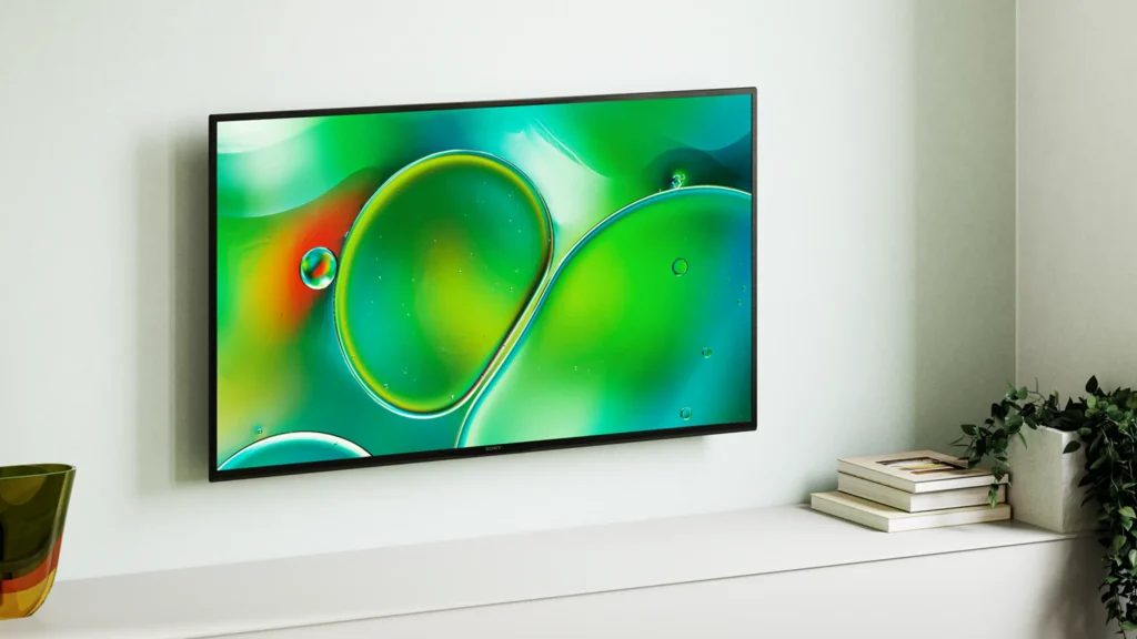
The Sony BRAVIA 2 series has been launched in India with models ranging from 43″ to 65″, available in two variants: S25 and S20. Both variants feature Google TV , 4K HDR LED displays, and the X1 Picture Processor for enhanced image quality. Key technologies include 4K X-Reality PRO for upscaling, Motionflow XR for smooth motion, and Live Color technology for vivid colors.
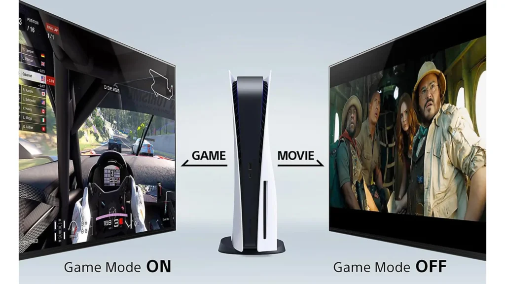
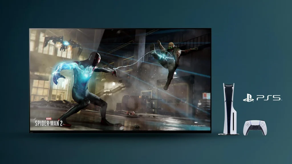
The S25 variant, aimed at gamers, includes Auto Low Latency Mode and Auto HDR Tone Mapping for PlayStation 5. Audio features include 20W speakers with Dolby Audio. Connectivity options encompass Wi-Fi, Bluetooth v5.0, and multiple HDMI and USB ports.
Both variants support Apple HomeKit, AirPlay, and voice control via Google Assistant. They also feature X-Protection PRO for durability and a minimalist design with options for wall mounting or using a slimline stand.
The main differences between the variants are their sizes: S20 is available in 43″ and 50″, while S25 comes in 55″ and 65″ sizes.
Sony BRAVIA 2 series Full Specifications: S25 and S20 Display
Type: LED Size: 43″, 50″, 55″, and 65″ Resolution: 4K (3840 x 2160) 50Hz display HDR10, HLG 4K X-Reality Pro Technology Motionflow XR 200 Live Colour Technology Dynamic Contrast Enhancer Audio
Output: 20W Open Baffle Speaker Dolby Audio Processor
Connectivity
Wi-Fi (802.11a/b/g/n/ac) Bluetooth v5.0 Operating System: Google TV
Storage : 16GB
Gaming
Auto Low Latency Mode (ALLM) Auto HDR Tone Mapping Auto Genre Picture Mode Others
X-Protection PRO technology -Protects from lightning strikes and Power fluctuations. Chromecast Built-in Apple Airplay Apple HomeKit Eco Dashboard Voice search I/O Ports
3x HDMI (eARC/ARC and HDCP2.3) 2x USB 1x Digital audio output Design: Narrow Bezel, Black color
Pricing and Availability:
65″ Model (K-65S25) : ₹95,990 (Available from 24 May 2024)55″ Model (K-55S25) : ₹74,990 (Available from 24 May 2024)50″ Model (K-50S20) : Yet to announce, coming soon43″ Model (K-43S20) : Yet to announce, coming soonSource: via
Read More
Scroll to Top