);mask-image:url(data:image/svg+xml;utf8, );content:"";margin:0 .4rem;display:inline-block;vertical-align:middle;line-height:1}.breadcrumb-trail .trail-items li:last-child:after{display:none}.bloghash-breadcrumbs{font-size:1.4rem;border-width:0}#page .page-header .bloghash-breadcrumbs a>span{color:inherit}#bloghash-scroll-top{-webkit-box-align:center;-ms-flex-align:center;align-items:center;-webkit-box-pack:center;-ms-flex-pack:center;justify-content:center;position:fixed;bottom:2.5rem;right:2rem;z-index:997;width:4rem;height:4rem;opacity:0;-webkit-transform:translate3d(0,3rem,0);transform:translate3d(0,3rem,0)}#bloghash-scroll-top .bloghash-scroll-icon{overflow:hidden;z-index:2}#bloghash-scroll-top .bloghash-icon{-webkit-box-align:center;-ms-flex-align:center;align-items:center;-webkit-box-pack:center;-ms-flex-pack:center;justify-content:center;height:2rem;color:var(--bloghash-white);-webkit-transform:translateY(1.1rem);-ms-transform:translateY(1.1rem);transform:translateY(1.1rem)}#bloghash-scroll-top:before{content:"";z-index:1;border-radius:10rem;background-color:var(--bloghash-primary);-webkit-transform:scale(1);-ms-transform:scale(1);transform:scale(1);border:.1rem solid rgb(185 185 185/.4)}#bloghash-scroll-top svg{fill:var(--bloghash-white)}#main .bloghash-widget{overflow:hidden}#main .bloghash-widget{margin-bottom:4rem}.widget-title,.wp-block-search .wp-block-search__label{margin-top:0;position:relative;display:block;margin-bottom:2.5rem}.wp-block-search .wp-block-search__label{width:auto;line-height:1.4}.bloghash-entry>:first-child,.wp-block-group__inner-container>:first-child{margin-top:0}.bloghash-entry>:last-child,.wp-block-group__inner-container>:last-child{margin-bottom:0}.wp-block-group__inner-container>:first-child:last-child{margin-bottom:0}.bloghash-entry p{margin-bottom:1.5rem;margin-top:1.5rem}.bloghash-entry figure{margin-top:2rem;margin-bottom:2rem}#main .content-area .entry-meta a{color:inherit}.entry-meta{font-size:1.3rem;font-weight:600;margin-top:1.2rem}.entry-meta .bloghash-icon{height:1.827rem;margin-right:.7rem;vertical-align:text-bottom}.entry-meta .entry-meta-elements>span{padding:0 1rem;line-height:1.2}.entry-meta .entry-meta-elements>span.posted-on{line-height:1.5}.entry-meta .entry-meta-elements>span,.entry-meta .entry-meta-elements>span .posted-by{-js-display:inline-flex;display:-webkit-inline-box;display:-ms-inline-flexbox;display:inline-flex;-webkit-box-align:center;-ms-flex-align:center;align-items:center}.entry-meta .entry-meta-elements>span:first-child{padding-left:0}.entry-meta .entry-meta-elements>span:last-child{margin-right:0;padding-right:0}.entry-meta .entry-meta-elements>span:before{content:"";position:relative;left:-1.1rem;width:4px;height:4px;border-radius:100%;background-color:var(--bloghash-primary)}.entry-meta .entry-meta-elements>span:first-child:before{display:none}.single-post .entry-content{margin-top:4rem}.single .entry-content img{margin:0 auto;display:block}.single .post-category{margin-bottom:.3rem;font-size:1.4rem}.single .post-category a{-js-display:inline-flex;display:-webkit-inline-box;display:-ms-inline-flexbox;display:inline-flex;margin:0 .4rem .8rem .4rem}.single .entry-header{text-align:start;margin-bottom:1rem}.single .entry-meta{text-align:start;margin-top:1.6rem}.single .entry-content{margin-bottom:5rem}.single .entry-content>:last-child{margin-bottom:0!important}.single.bloghash-page-title-align-left .bloghash-article>.entry-header,.single.bloghash-page-title-align-left .bloghash-article>.post-category{text-align:start}.single.bloghash-page-title-align-left .bloghash-article>.entry-meta>.entry-meta-elements{-webkit-box-pack:start;-ms-flex-pack:start;justify-content:flex-start}.bloghash-has-comments-toggle #comments{display:none;margin-top:4rem}#comments{margin-top:5rem}#comments .comments-title-wrapper{margin:0 0 4rem 0}#comments .comments-title-wrapper p{text-align:center;margin-top:.6rem;font-size:1.6rem}#respond{margin-top:4rem}#respond .comment-reply-title{-webkit-box-align:center;-ms-flex-align:center;align-items:center;-webkit-box-pack:center;-ms-flex-pack:center;justify-content:center}#respond .must-log-in{text-align:center;color:#66717f;margin-top:.6rem}#cancel-comment-reply-link{font-size:1.3rem;border-radius:var(--bloghash-normal-radius);border:.2rem solid currentColor;font-weight:500;padding:.4rem .7rem;line-height:1;text-decoration:none;text-transform:capitalize;margin-left:1.4rem;color:inherit}#page .center-text{text-align:center}.bloghash-hamburger{padding:0 0;display:inline-block;font:inherit;color:inherit;text-transform:none;background-color:#fff0;border:0;margin:0;overflow:visible}.hamburger-box{width:2.5rem;height:1.4rem;display:inline-block;position:relative}.hamburger-inner{display:block;top:50%;margin-top:-.1rem}.hamburger-inner,.hamburger-inner::before,.hamburger-inner::after{width:2.8rem;height:2px;background-color:#111827;border-radius:var(--bloghash-normal-radius);position:absolute}.hamburger-inner::before,.hamburger-inner::after{content:"";display:block}.hamburger-inner::before{top:-5px}.hamburger-inner::after{bottom:-5px}.bloghash-mobile-nav{order:1;display:none;margin-left:2.4rem}.bloghash-hamburger,.bloghash-mobile-nav{-webkit-box-align:center;-ms-flex-align:center;align-items:center}body:not(.is-mobile-menu-active) .bloghash-hamburger .hamburger-box .hamburger-inner::before{width:1.5rem}.bloghash-hamburger{-js-display:inline-flex;display:-webkit-inline-box;display:-ms-inline-flexbox;display:inline-flex;border-radius:var(--bloghash-normal-radius)}.bloghash-hamburger .hamburger-inner,.bloghash-hamburger .hamburger-inner::before,.bloghash-hamburger .hamburger-inner::after{background-color:currentColor}#bloghash-header:after{content:"";position:fixed;top:100%;left:0;right:0;height:100vh;background-color:rgb(255 255 255/.85);z-index:991;opacity:0;visibility:hidden;will-change:opacity,visibility;-webkit-transform:translate3d(0,0,0);transform:translate3d(0,0,0)}@media only screen and (max-width:868px){.bloghash-container{padding:0 3rem}.bloghash-mobile-nav{margin-left:1.6rem}}@media only screen and (max-width:599px){.bloghash-header-element{position:static}.page-header>.bloghash-container{-webkit-box-align:start;-ms-flex-align:start;align-items:flex-start;-webkit-box-orient:vertical;-webkit-box-direction:normal;-ms-flex-direction:column;flex-direction:column}}@media only screen and (max-width:480px){#page{min-height:-webkit-fill-available}}@media only screen and (max-width:960px){#main>.bloghash-container{display:block}#primary{max-width:100%!important;padding-left:0!important;padding-right:0!important;margin-top:4rem}.site-main #secondary{width:100%;margin-top:4rem}}@media all and (-ms-high-contrast:none),(-ms-high-contrast:active){#main>.bloghash-container #primary{-ms-flex-preferred-size:0%;flex-basis:0%}}.content-area a:not(.bloghash-btn,.wp-block-button__link,.page-numbers,[class^="cat-"],[rel="tag"]){color:var(--bloghash-primary)}.bloghash-nav>ul .sub-menu::after{border-bottom-color:var(--bloghash-primary);outline:none!important}.bloghash-nav .sub-menu{border-top-color:var(--bloghash-primary)}::-webkit-selection{background-color:var(--bloghash-primary);color:var(--bloghash-white)}::-webkit-scrollbar-thumb{background:rgb(0 0 0/.2)}::-webkit-scrollbar-thumb:hover{background:rgb(0 0 0/.4)}@media (prefers-reduced-motion:reduce){*{animation-duration:0s!important}}.bloghash-glassmorphism{position:fixed;right:0;left:0;bottom:0;display:flex;overflow:hidden;z-index:-1}.bloghash-glassmorphism .block{width:28.8rem;height:28.8rem;filter:blur(64px);mix-blend-mode:multiply;border-radius:999px;display:block;opacity:.1}.bloghash-glassmorphism .block.one{margin-top:5rem;background-color:#ef233c}.bloghash-glassmorphism .block.two{margin-top:16rem;margin-left:-8rem;background-color:#04868b}@media only screen and (min-width:768px){.bloghash-glassmorphism{top:4rem}}@media only screen and (min-width:1024px){.bloghash-glassmorphism .block{width:38.4rem;height:38.4rem}}@media only screen and (min-width:1280px){.bloghash-glassmorphism{top:8rem}}.wp-block-image:not(.alignfull,.is-style-rounded) img{border-radius:calc(var(--bloghash-radius) - 1.2rem);overflow:hidden}.post-category .cat-links a.cat-12399{--bloghash-primary:#F43676;--bloghash-primary_80:#fdd7e4}:root{--bloghash-primary:#F43676;--bloghash-primary_80:#fdd7e4;--bloghash-primary_15:#f6558b;--bloghash-primary_27:rgba(244,54,118,0.27);--bloghash-primary_10:rgba(244,54,118,0.1)}#bloghash-header-inner{background:#FFF}.bloghash-logo .site-description{color:#66717f}#bloghash-header,.bloghash-logo a,.bloghash-hamburger{color:#131315}#bloghash-header-inner{border-color:rgb(185 185 185/.4);border-bottom-width:1px}@media screen and (max-width:960px){#bloghash-header-inner .bloghash-nav{display:none;color:#000}.bloghash-mobile-toggen,.bloghash-mobile-nav{display:inline-flex}#bloghash-header-inner{position:relative}#bloghash-header-inner .bloghash-nav>ul>li>a{color:inherit}#bloghash-header-inner .site-navigation{display:none;position:absolute;top:100%;width:100%;height:100%;min-height:100vh;left:0;right:0;margin:-1px 0 0;background:#FFF;border-top:1px solid #eaeaea;box-shadow:0 15px 25px -10px rgb(50 52 54/.125);z-index:999;font-size:1.7rem;padding:0}#bloghash-header-inner .site-navigation>ul{overflow-y:auto;max-height:68vh;display:block}#bloghash-header-inner .site-navigation>ul>li>a{padding:0!important}#bloghash-header-inner .site-navigation>ul li{display:block;width:100%;padding:0;margin:0;margin-left:0!important}#bloghash-header-inner .site-navigation>ul .sub-menu{position:static;display:none;border:none;box-shadow:none;border:0;opacity:1;visibility:visible;font-size:1.7rem;transform:none;background:#f8f8f8;min-width:initial;left:0;padding:0;margin:0;border-radius:0;line-height:inherit}#bloghash-header-inner .site-navigation>ul .sub-menu>li>a>span{padding-left:50px!important}#bloghash-header-inner .site-navigation>ul .sub-menu a>span{padding:10px 30px 10px 50px}#bloghash-header-inner .site-navigation>ul a{padding:0;position:relative;background:none}#bloghash-header-inner .site-navigation>ul li{border-bottom:1px solid #eaeaea}#bloghash-header-inner .site-navigation>ul>li:last-child{border-bottom:0}#bloghash-header-inner .site-navigation>ul a>span{padding:10px 30px!important;width:100%;display:block}#bloghash-header-inner .site-navigation>ul a>span::after,#bloghash-header-inner .site-navigation>ul a>span::before{display:none!important}#bloghash-header-inner .site-navigation>ul .menu-item-has-children>a{display:inline-flex;width:100%;max-width:calc(100% - 50px)}#bloghash-header-inner .bloghash-nav .menu-item-has-children>a>span{border-right:1px solid rgb(185 185 185/.4)}#bloghash-header-inner .bloghash-nav .menu-item-has-children>a>.bloghash-icon{transform:none;width:50px;margin:0;position:absolute;right:0;height:1em;display:none}.bloghash-mobile-toggen{width:50px;height:1em;background:none;border:none}.bloghash-mobile-toggen .bloghash-icon{transform:none;width:50px;margin:0;position:absolute;right:0;height:1em}}.bloghash-nav.bloghash-header-element,.bloghash-header-layout-1 .bloghash-header-widgets{font-weight:600;font-family:"Inter Tight",Helvetica,Arial,sans-serif;font-size:1.7rem;line-height:1.5}#secondary{width:30%}body:not(.bloghash-no-sidebar) #primary{max-width:70%}.bloghash-layout__boxed-separated #comments,.bloghash-layout__boxed-separated #content>article,.bloghash-layout__boxed-separated.bloghash-sidebar-style-2 #secondary .bloghash-widget{background-color:#FFF}body{color:#002050}#comments .no-comments{color:#002050}h1,h3,.h4,a,.entry-meta,.bloghash-logo .site-title,.wp-block-search__label{color:#302D55}:root{--bloghash-secondary:#302D55}.bloghash-container{max-width:1480px}.bloghash-logo .logo-inner{margin-top:27px;margin-right:10px;margin-bottom:27px;margin-left:10px}@media only screen and (max-width:768px){.bloghash-logo .logo-inner{margin-top:25px;margin-right:1px;margin-bottom:25px}}.page-header{background:rgb(244 54 118/.1)}.page-header{border-color:rgb(0 0 0/.062);border-style:solid;border-bottom-width:1px}.bloghash-breadcrumbs{padding-top:15px;padding-bottom:15px}html{font-size:62.5%}@media only screen and (max-width:768px){html{font-size:53%}}@media only screen and (max-width:480px){html{font-size:50%}}*{-moz-osx-font-smoothing:grayscale;-webkit-font-smoothing:antialiased}body{font-weight:400;font-family:"Be Vietnam Pro",Helvetica,Arial,sans-serif;font-size:1.7rem;line-height:1.75}h1,.bloghash-logo .site-title,h3,.h4{font-weight:700;font-style:normal;text-transform:none;text-decoration:none;font-family:"Be Vietnam Pro",Helvetica,Arial,sans-serif}h1,.bloghash-logo .site-title{font-weight:700;font-size:4rem;line-height:1.4}h3{font-weight:700;font-size:2.8rem;line-height:1.4}.h4{font-weight:700;font-size:2.4rem;line-height:1.4}h3 em{font-style:italic;font-family:"Playfair Display",Georgia,serif}h3 em{font-style:italic;font-family:"Playfair Display",Georgia,serif}#bloghash-header .bloghash-logo .site-title{font-size:3rem}#main .widget-title,#secondary .bloghash-widget .wp-block-search__label{font-size:2.4rem}.single-post .entry-content{font-size:1.6rem}.wp-block-jetpack-top-posts{margin-bottom:1.5em}.wp-block-jetpack-top-posts span{display:block;word-wrap:break-word}.wp-block-jetpack-top-posts.is-list-layout .jetpack-top-posts-item{margin-bottom:1.5em}
Westinghouse Launches W2 HD Series & Quantum Series 4K UHD TVs, Starting from Rs. 10,499
Skip to content 
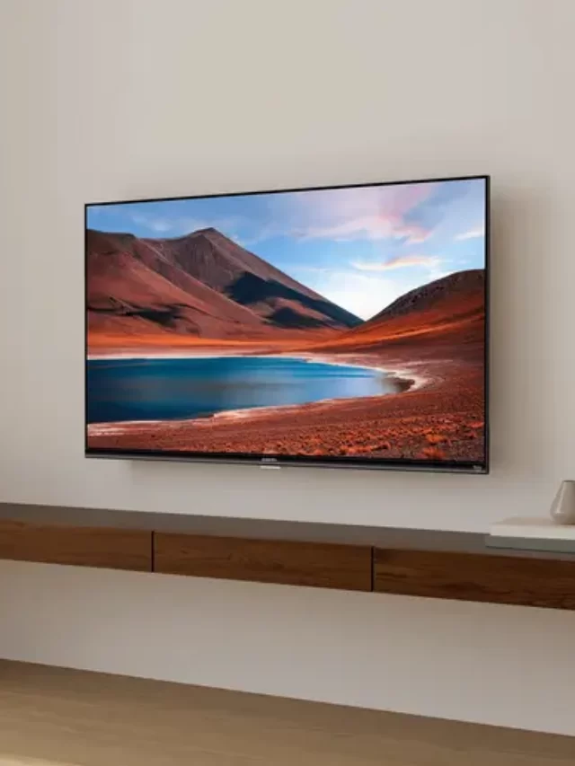
Westinghouse has launched new range of TV’s in collaboration with Amazon India, Westinghouse W2 Series and Westinghouse Quantum Series ahead for the upcoming Prime Day sale starting on July 15th. These new series offers wide range of options to customers from 32-inch HD to 55-inch 4K variants.
These TVs have features like Android OS, Dolby Audio, HDR10, MEMC, Chromecast and more. Check out full specifications and features from below
Westinghouse W2 Series Android TV’s Specification s
Specification Details Design Bezel-less Screen Sizes 32″ HD, 40″ FHD, 43″ FHD Processor Realtek RAM 1 GB ROM 8 GB Speakers 2 x 36W Box Speakers with surround sound technology Remote Voice-enabled with dedicated shortcut keys Ports 3 HDMI, 2 USB Operating System Android 11
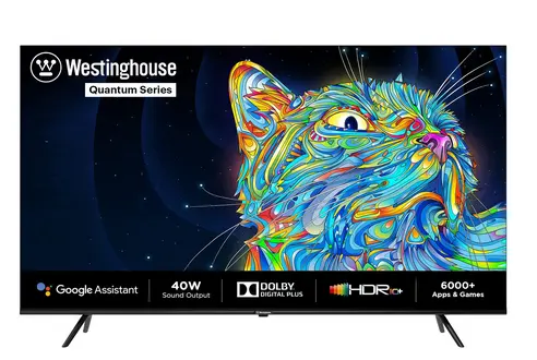
Westinghouse 4K Quantum Series Google TV’s Specifications
Specification Details Design Bezel-less and air-slim Screen Sizes 50″ 4K, 55″ 4K Display 4K with HDR 10+ Processor MT9062 RAM 2 GB ROM 16 GB Speakers 2x 48W Dolby Audio Speakers with DTS TruSurround technology Ports 3 HDMI, 2 USB Connectivity Bluetooth and Wi-Fi Remote Voice-enabled Operating System Google TV
Price and availability Buyers can purchase the Westinghouse W2 Series TVs at the following prices: the 32″ HD TV is priced at Rs. 10,499, the 40″ FHD TV is priced at Rs. 16,999, and the 43″ FHD TV is priced at Rs. 17,999.
Westinghouse 4K Quantum Series Google TVs are priced as follows: the 50″ 4K TV is priced at Rs. 27,999, and the 55″ 4K TV is priced at Rs. 32,999.
These TVs will be available at discounted prices during the Amazon India Prime Day sale , which begins with early access on July 14th, 2023, and concludes on July 16th, 2023.
Read More
Scroll to Top