);mask-image:url(data:image/svg+xml;utf8, );content:"";margin:0 .4rem;display:inline-block;vertical-align:middle;line-height:1}.breadcrumb-trail .trail-items li:last-child:after{display:none}.bloghash-breadcrumbs{font-size:1.4rem;border-width:0}#page .page-header .bloghash-breadcrumbs a>span{color:inherit}#bloghash-scroll-top{-webkit-box-align:center;-ms-flex-align:center;align-items:center;-webkit-box-pack:center;-ms-flex-pack:center;justify-content:center;position:fixed;bottom:2.5rem;right:2rem;z-index:997;width:4rem;height:4rem;opacity:0;-webkit-transform:translate3d(0,3rem,0);transform:translate3d(0,3rem,0)}#bloghash-scroll-top .bloghash-scroll-icon{overflow:hidden;z-index:2}#bloghash-scroll-top .bloghash-icon{-webkit-box-align:center;-ms-flex-align:center;align-items:center;-webkit-box-pack:center;-ms-flex-pack:center;justify-content:center;height:2rem;color:var(--bloghash-white);-webkit-transform:translateY(1.1rem);-ms-transform:translateY(1.1rem);transform:translateY(1.1rem)}#bloghash-scroll-top:before{content:"";z-index:1;border-radius:10rem;background-color:var(--bloghash-primary);-webkit-transform:scale(1);-ms-transform:scale(1);transform:scale(1);border:.1rem solid rgb(185 185 185/.4)}#bloghash-scroll-top svg{fill:var(--bloghash-white)}#main .bloghash-widget{overflow:hidden}#main .bloghash-widget{margin-bottom:4rem}.widget-title,.wp-block-search .wp-block-search__label{margin-top:0;position:relative;display:block;margin-bottom:2.5rem}.wp-block-search .wp-block-search__label{width:auto;line-height:1.4}.bloghash-entry>:first-child,.wp-block-group__inner-container>:first-child{margin-top:0}.bloghash-entry>:last-child,.wp-block-group__inner-container>:last-child{margin-bottom:0}.wp-block-group__inner-container>:first-child:last-child{margin-bottom:0}.bloghash-entry p{margin-bottom:1.5rem;margin-top:1.5rem}.bloghash-entry figure{margin-top:2rem;margin-bottom:2rem}#main .content-area .entry-meta a{color:inherit}.entry-meta{font-size:1.3rem;font-weight:600;margin-top:1.2rem}.entry-meta .bloghash-icon{height:1.827rem;margin-right:.7rem;vertical-align:text-bottom}.entry-meta .entry-meta-elements>span{padding:0 1rem;line-height:1.2}.entry-meta .entry-meta-elements>span.posted-on{line-height:1.5}.entry-meta .entry-meta-elements>span,.entry-meta .entry-meta-elements>span .posted-by{-js-display:inline-flex;display:-webkit-inline-box;display:-ms-inline-flexbox;display:inline-flex;-webkit-box-align:center;-ms-flex-align:center;align-items:center}.entry-meta .entry-meta-elements>span:first-child{padding-left:0}.entry-meta .entry-meta-elements>span:last-child{margin-right:0;padding-right:0}.entry-meta .entry-meta-elements>span:before{content:"";position:relative;left:-1.1rem;width:4px;height:4px;border-radius:100%;background-color:var(--bloghash-primary)}.entry-meta .entry-meta-elements>span:first-child:before{display:none}.single-post .entry-content{margin-top:4rem}.single .entry-content img{margin:0 auto;display:block}.single .post-category{margin-bottom:.3rem;font-size:1.4rem}.single .post-category a{-js-display:inline-flex;display:-webkit-inline-box;display:-ms-inline-flexbox;display:inline-flex;margin:0 .4rem .8rem .4rem}.single .entry-header{text-align:start;margin-bottom:1rem}.single .entry-meta{text-align:start;margin-top:1.6rem}.single .entry-content{margin-bottom:5rem}.single .entry-content>:last-child{margin-bottom:0!important}.single.bloghash-page-title-align-left .bloghash-article>.entry-header,.single.bloghash-page-title-align-left .bloghash-article>.post-category{text-align:start}.single.bloghash-page-title-align-left .bloghash-article>.entry-meta>.entry-meta-elements{-webkit-box-pack:start;-ms-flex-pack:start;justify-content:flex-start}.bloghash-has-comments-toggle #comments{display:none;margin-top:4rem}#comments{margin-top:5rem}#comments .comments-title-wrapper{margin:0 0 4rem 0}#comments .comments-title-wrapper p{text-align:center;margin-top:.6rem;font-size:1.6rem}#respond{margin-top:4rem}#respond .comment-reply-title{-webkit-box-align:center;-ms-flex-align:center;align-items:center;-webkit-box-pack:center;-ms-flex-pack:center;justify-content:center}#respond .must-log-in{text-align:center;color:#66717f;margin-top:.6rem}#cancel-comment-reply-link{font-size:1.3rem;border-radius:var(--bloghash-normal-radius);border:.2rem solid currentColor;font-weight:500;padding:.4rem .7rem;line-height:1;text-decoration:none;text-transform:capitalize;margin-left:1.4rem;color:inherit}#page .center-text{text-align:center}.bloghash-hamburger{padding:0 0;display:inline-block;font:inherit;color:inherit;text-transform:none;background-color:#fff0;border:0;margin:0;overflow:visible}.hamburger-box{width:2.5rem;height:1.4rem;display:inline-block;position:relative}.hamburger-inner{display:block;top:50%;margin-top:-.1rem}.hamburger-inner,.hamburger-inner::before,.hamburger-inner::after{width:2.8rem;height:2px;background-color:#111827;border-radius:var(--bloghash-normal-radius);position:absolute}.hamburger-inner::before,.hamburger-inner::after{content:"";display:block}.hamburger-inner::before{top:-5px}.hamburger-inner::after{bottom:-5px}.bloghash-mobile-nav{order:1;display:none;margin-left:2.4rem}.bloghash-hamburger,.bloghash-mobile-nav{-webkit-box-align:center;-ms-flex-align:center;align-items:center}body:not(.is-mobile-menu-active) .bloghash-hamburger .hamburger-box .hamburger-inner::before{width:1.5rem}.bloghash-hamburger{-js-display:inline-flex;display:-webkit-inline-box;display:-ms-inline-flexbox;display:inline-flex;border-radius:var(--bloghash-normal-radius)}.bloghash-hamburger .hamburger-inner,.bloghash-hamburger .hamburger-inner::before,.bloghash-hamburger .hamburger-inner::after{background-color:currentColor}#bloghash-header:after{content:"";position:fixed;top:100%;left:0;right:0;height:100vh;background-color:rgb(255 255 255/.85);z-index:991;opacity:0;visibility:hidden;will-change:opacity,visibility;-webkit-transform:translate3d(0,0,0);transform:translate3d(0,0,0)}@media only screen and (max-width:868px){.bloghash-container{padding:0 3rem}.bloghash-mobile-nav{margin-left:1.6rem}}@media only screen and (max-width:599px){.bloghash-header-element{position:static}.page-header>.bloghash-container{-webkit-box-align:start;-ms-flex-align:start;align-items:flex-start;-webkit-box-orient:vertical;-webkit-box-direction:normal;-ms-flex-direction:column;flex-direction:column}}@media only screen and (max-width:480px){#page{min-height:-webkit-fill-available}}@media only screen and (max-width:960px){#main>.bloghash-container{display:block}#primary{max-width:100%!important;padding-left:0!important;padding-right:0!important;margin-top:4rem}.site-main #secondary{width:100%;margin-top:4rem}}@media all and (-ms-high-contrast:none),(-ms-high-contrast:active){#main>.bloghash-container #primary{-ms-flex-preferred-size:0%;flex-basis:0%}}.content-area a:not(.bloghash-btn,.wp-block-button__link,.page-numbers,[class^="cat-"],[rel="tag"]){color:var(--bloghash-primary)}.bloghash-nav>ul .sub-menu::after{border-bottom-color:var(--bloghash-primary);outline:none!important}.bloghash-nav .sub-menu{border-top-color:var(--bloghash-primary)}::-webkit-selection{background-color:var(--bloghash-primary);color:var(--bloghash-white)}::-webkit-scrollbar-thumb{background:rgb(0 0 0/.2)}::-webkit-scrollbar-thumb:hover{background:rgb(0 0 0/.4)}@media (prefers-reduced-motion:reduce){*{animation-duration:0s!important}}.bloghash-glassmorphism{position:fixed;right:0;left:0;bottom:0;display:flex;overflow:hidden;z-index:-1}.bloghash-glassmorphism .block{width:28.8rem;height:28.8rem;filter:blur(64px);mix-blend-mode:multiply;border-radius:999px;display:block;opacity:.1}.bloghash-glassmorphism .block.one{margin-top:5rem;background-color:#ef233c}.bloghash-glassmorphism .block.two{margin-top:16rem;margin-left:-8rem;background-color:#04868b}@media only screen and (min-width:768px){.bloghash-glassmorphism{top:4rem}}@media only screen and (min-width:1024px){.bloghash-glassmorphism .block{width:38.4rem;height:38.4rem}}@media only screen and (min-width:1280px){.bloghash-glassmorphism{top:8rem}}.wp-block-image:not(.alignfull,.is-style-rounded) img{border-radius:calc(var(--bloghash-radius) - 1.2rem);overflow:hidden}.post-category .cat-links a.cat-12399{--bloghash-primary:#F43676;--bloghash-primary_80:#fdd7e4}:root{--bloghash-primary:#F43676;--bloghash-primary_80:#fdd7e4;--bloghash-primary_15:#f6558b;--bloghash-primary_27:rgba(244,54,118,0.27);--bloghash-primary_10:rgba(244,54,118,0.1)}#bloghash-header-inner{background:#FFF}.bloghash-logo .site-description{color:#66717f}#bloghash-header,.bloghash-logo a,.bloghash-hamburger{color:#131315}#bloghash-header-inner{border-color:rgb(185 185 185/.4);border-bottom-width:1px}@media screen and (max-width:960px){#bloghash-header-inner .bloghash-nav{display:none;color:#000}.bloghash-mobile-toggen,.bloghash-mobile-nav{display:inline-flex}#bloghash-header-inner{position:relative}#bloghash-header-inner .bloghash-nav>ul>li>a{color:inherit}#bloghash-header-inner .site-navigation{display:none;position:absolute;top:100%;width:100%;height:100%;min-height:100vh;left:0;right:0;margin:-1px 0 0;background:#FFF;border-top:1px solid #eaeaea;box-shadow:0 15px 25px -10px rgb(50 52 54/.125);z-index:999;font-size:1.7rem;padding:0}#bloghash-header-inner .site-navigation>ul{overflow-y:auto;max-height:68vh;display:block}#bloghash-header-inner .site-navigation>ul>li>a{padding:0!important}#bloghash-header-inner .site-navigation>ul li{display:block;width:100%;padding:0;margin:0;margin-left:0!important}#bloghash-header-inner .site-navigation>ul .sub-menu{position:static;display:none;border:none;box-shadow:none;border:0;opacity:1;visibility:visible;font-size:1.7rem;transform:none;background:#f8f8f8;min-width:initial;left:0;padding:0;margin:0;border-radius:0;line-height:inherit}#bloghash-header-inner .site-navigation>ul .sub-menu>li>a>span{padding-left:50px!important}#bloghash-header-inner .site-navigation>ul .sub-menu a>span{padding:10px 30px 10px 50px}#bloghash-header-inner .site-navigation>ul a{padding:0;position:relative;background:none}#bloghash-header-inner .site-navigation>ul li{border-bottom:1px solid #eaeaea}#bloghash-header-inner .site-navigation>ul>li:last-child{border-bottom:0}#bloghash-header-inner .site-navigation>ul a>span{padding:10px 30px!important;width:100%;display:block}#bloghash-header-inner .site-navigation>ul a>span::after,#bloghash-header-inner .site-navigation>ul a>span::before{display:none!important}#bloghash-header-inner .site-navigation>ul .menu-item-has-children>a{display:inline-flex;width:100%;max-width:calc(100% - 50px)}#bloghash-header-inner .bloghash-nav .menu-item-has-children>a>span{border-right:1px solid rgb(185 185 185/.4)}#bloghash-header-inner .bloghash-nav .menu-item-has-children>a>.bloghash-icon{transform:none;width:50px;margin:0;position:absolute;right:0;height:1em;display:none}.bloghash-mobile-toggen{width:50px;height:1em;background:none;border:none}.bloghash-mobile-toggen .bloghash-icon{transform:none;width:50px;margin:0;position:absolute;right:0;height:1em}}.bloghash-nav.bloghash-header-element,.bloghash-header-layout-1 .bloghash-header-widgets{font-weight:600;font-family:"Inter Tight",Helvetica,Arial,sans-serif;font-size:1.7rem;line-height:1.5}#secondary{width:30%}body:not(.bloghash-no-sidebar) #primary{max-width:70%}.bloghash-layout__boxed-separated #comments,.bloghash-layout__boxed-separated #content>article,.bloghash-layout__boxed-separated.bloghash-sidebar-style-2 #secondary .bloghash-widget{background-color:#FFF}body{color:#002050}#comments .no-comments{color:#002050}h1,h3,.h4,a,.entry-meta,.bloghash-logo .site-title,.wp-block-search__label{color:#302D55}:root{--bloghash-secondary:#302D55}.bloghash-container{max-width:1480px}.bloghash-logo .logo-inner{margin-top:27px;margin-right:10px;margin-bottom:27px;margin-left:10px}@media only screen and (max-width:768px){.bloghash-logo .logo-inner{margin-top:25px;margin-right:1px;margin-bottom:25px}}.page-header{background:rgb(244 54 118/.1)}.page-header{border-color:rgb(0 0 0/.062);border-style:solid;border-bottom-width:1px}.bloghash-breadcrumbs{padding-top:15px;padding-bottom:15px}html{font-size:62.5%}@media only screen and (max-width:768px){html{font-size:53%}}@media only screen and (max-width:480px){html{font-size:50%}}*{-moz-osx-font-smoothing:grayscale;-webkit-font-smoothing:antialiased}body{font-weight:400;font-family:"Be Vietnam Pro",Helvetica,Arial,sans-serif;font-size:1.7rem;line-height:1.75}h1,.bloghash-logo .site-title,h3,.h4{font-weight:700;font-style:normal;text-transform:none;text-decoration:none;font-family:"Be Vietnam Pro",Helvetica,Arial,sans-serif}h1,.bloghash-logo .site-title{font-weight:700;font-size:4rem;line-height:1.4}h3{font-weight:700;font-size:2.8rem;line-height:1.4}.h4{font-weight:700;font-size:2.4rem;line-height:1.4}h3 em{font-style:italic;font-family:"Playfair Display",Georgia,serif}h3 em{font-style:italic;font-family:"Playfair Display",Georgia,serif}#bloghash-header .bloghash-logo .site-title{font-size:3rem}#main .widget-title,#secondary .bloghash-widget .wp-block-search__label{font-size:2.4rem}.single-post .entry-content{font-size:1.6rem}.wp-block-jetpack-top-posts{margin-bottom:1.5em}.wp-block-jetpack-top-posts span{display:block;word-wrap:break-word}.wp-block-jetpack-top-posts.is-list-layout .jetpack-top-posts-item{margin-bottom:1.5em}
Hisense Unveils World's First 120-Inch Laser TV 120L9HE with Trichroma Laser technology
Skip to content Hisense India has introduced the Hisense 120L9HE Laser TV, the world’s first premium 120-inch 4K smart laser TV into the Indian market. The flagship Hisense Laser TV comes with a Trichroma Laser technology. This advanced technology allows the TV to achieve an outstanding 107% of the BT.2020 colour space, delivering vibrant and lifelike visuals that are a treat for the eyes.
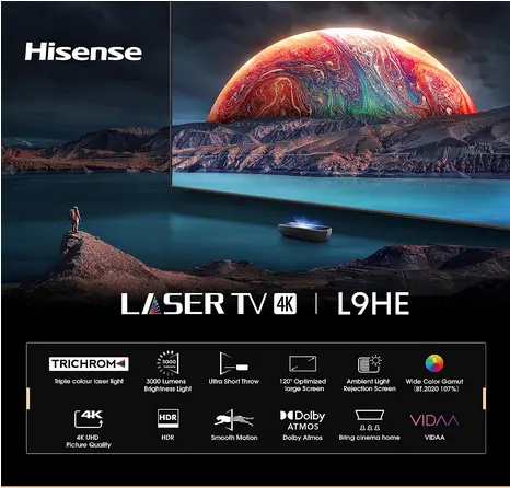
The Hisense 120L9HE Laser TV offers a resolution of 4K Ultra HD (3840×2160) at 60Hz. It utilizes RGB Triple Colour Laser Light Source technology and boasts an ALR screen (Ambient Light Rejection) with a wide colour gamut of 107%. It also features TUV Eye Protection and 10-bit Colorimetry.
To complement the stunning visuals, the Hisense Laser TV is equipped with 40W Dolby Atmos sound, ensuring an immersive audio experience that matches the grandeur of the screen. It also had an built-in Alexa allows users to control the TV using voice commands and proximity sensor to automatically adjusting the brightness of the laser light source when a person is detected within 50 cm of the screen.
The Hisense 120L9HE Laser TV comes with 3GB RAM and 8GB internal storage. Running on the VIDAA U6 operating system, the Hisense 120L9HE Laser TV combines powerful hardware with a user-friendly interface, allowing users to navigate seamlessly through their favorite content.
Quick Hisense 120L9HE Laser TV Specifications: Model: Hisense Trichrom ALR Screen (120L9HE)
Resolution: 4K Ultra HD (3840×2160) Refresh Rate: 60 hertz RGB Triple Colour Laser Light Source ALR (Ambient Light Rejection) screen Wide Colour Gamut: 107% TUV Eye Protection 10-bit Colorimetry Display:
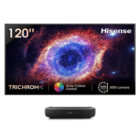
Brightness: 3000 Lumens 4K Ultra HD Wide Colour Gamut: 145% NTSC 10-bit Colorimetry Extra-large ALR screen: 120 inches Ambient Light Rejection Screen RGB Triple Colour Laser Light Source Connectivity:
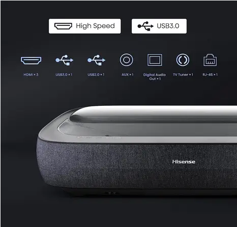
2 HDMI 2.1 and 1 HDMI 2.0 ports to connect set-top boxes, Blu-ray players, gaming consoles HDMI 2 eARC supported 1 USB 3.0 and 1 USB 2.0 ports to connect hard drives and other USB devices Sound: 40 Watts Dolby Audio Powerful Stereo Speakers
Smart Laser TV Features:
VIDAA U6 Quick Remote, App Store, Netflix, Prime Video, Yupp TV, Hungama & more Warranty: 3 Year Comprehensive Warranty
Price and availability The premium features and cutting-edge technology Hisense Laser TV 120L9HE is priced at Rs 4,99,999. Buyers can purchase this flagship TV exclusively on Amazon during the Prime Day Sale starting from 15th July.
As part of a limited-time introductory offer, Hisense is offering a 3-year comprehensive warranty from date of purchase.
Read More
Scroll to Top