);mask-image:url(data:image/svg+xml;utf8, );content:"";margin:0 .4rem;display:inline-block;vertical-align:middle;line-height:1}.breadcrumb-trail .trail-items li:last-child:after{display:none}.bloghash-breadcrumbs{font-size:1.4rem;border-width:0}#page .page-header .bloghash-breadcrumbs a>span{color:inherit}#bloghash-scroll-top{-webkit-box-align:center;-ms-flex-align:center;align-items:center;-webkit-box-pack:center;-ms-flex-pack:center;justify-content:center;position:fixed;bottom:2.5rem;right:2rem;z-index:997;width:4rem;height:4rem;opacity:0;-webkit-transform:translate3d(0,3rem,0);transform:translate3d(0,3rem,0)}#bloghash-scroll-top .bloghash-scroll-icon{overflow:hidden;z-index:2}#bloghash-scroll-top .bloghash-icon{-webkit-box-align:center;-ms-flex-align:center;align-items:center;-webkit-box-pack:center;-ms-flex-pack:center;justify-content:center;height:2rem;color:var(--bloghash-white);-webkit-transform:translateY(1.1rem);-ms-transform:translateY(1.1rem);transform:translateY(1.1rem)}#bloghash-scroll-top:before{content:"";z-index:1;border-radius:10rem;background-color:var(--bloghash-primary);-webkit-transform:scale(1);-ms-transform:scale(1);transform:scale(1);border:.1rem solid rgb(185 185 185/.4)}#bloghash-scroll-top svg{fill:var(--bloghash-white)}#main .bloghash-widget{overflow:hidden}#main .bloghash-widget{margin-bottom:4rem}.widget-title,.wp-block-search .wp-block-search__label{margin-top:0;position:relative;display:block;margin-bottom:2.5rem}.wp-block-search .wp-block-search__label{width:auto;line-height:1.4}.bloghash-entry>:first-child,.wp-block-group__inner-container>:first-child{margin-top:0}.bloghash-entry>:last-child,.wp-block-group__inner-container>:last-child{margin-bottom:0}.wp-block-group__inner-container>:first-child:last-child{margin-bottom:0}.bloghash-entry p{margin-bottom:1.5rem;margin-top:1.5rem}.bloghash-entry figure{margin-top:2rem;margin-bottom:2rem}#main .content-area .entry-meta a{color:inherit}.entry-meta{font-size:1.3rem;font-weight:600;margin-top:1.2rem}.entry-meta .bloghash-icon{height:1.827rem;margin-right:.7rem;vertical-align:text-bottom}.entry-meta .entry-meta-elements>span{padding:0 1rem;line-height:1.2}.entry-meta .entry-meta-elements>span.posted-on{line-height:1.5}.entry-meta .entry-meta-elements>span,.entry-meta .entry-meta-elements>span .posted-by{-js-display:inline-flex;display:-webkit-inline-box;display:-ms-inline-flexbox;display:inline-flex;-webkit-box-align:center;-ms-flex-align:center;align-items:center}.entry-meta .entry-meta-elements>span:first-child{padding-left:0}.entry-meta .entry-meta-elements>span:last-child{margin-right:0;padding-right:0}.entry-meta .entry-meta-elements>span:before{content:"";position:relative;left:-1.1rem;width:4px;height:4px;border-radius:100%;background-color:var(--bloghash-primary)}.entry-meta .entry-meta-elements>span:first-child:before{display:none}.single-post .entry-content{margin-top:4rem}.single .entry-content img{margin:0 auto;display:block}.single .post-category{margin-bottom:.3rem;font-size:1.4rem}.single .post-category a{-js-display:inline-flex;display:-webkit-inline-box;display:-ms-inline-flexbox;display:inline-flex;margin:0 .4rem .8rem .4rem}.single .entry-header{text-align:start;margin-bottom:1rem}.single .entry-meta{text-align:start;margin-top:1.6rem}.single .entry-content{margin-bottom:5rem}.single .entry-content>:last-child{margin-bottom:0!important}.single.bloghash-page-title-align-left .bloghash-article>.entry-header,.single.bloghash-page-title-align-left .bloghash-article>.post-category{text-align:start}.single.bloghash-page-title-align-left .bloghash-article>.entry-meta>.entry-meta-elements{-webkit-box-pack:start;-ms-flex-pack:start;justify-content:flex-start}.bloghash-has-comments-toggle #comments{display:none;margin-top:4rem}#comments{margin-top:5rem}#comments .comments-title-wrapper{margin:0 0 4rem 0}#comments .comments-title-wrapper p{text-align:center;margin-top:.6rem;font-size:1.6rem}#respond{margin-top:4rem}#respond .comment-reply-title{-webkit-box-align:center;-ms-flex-align:center;align-items:center;-webkit-box-pack:center;-ms-flex-pack:center;justify-content:center}#respond .must-log-in{text-align:center;color:#66717f;margin-top:.6rem}#cancel-comment-reply-link{font-size:1.3rem;border-radius:var(--bloghash-normal-radius);border:.2rem solid currentColor;font-weight:500;padding:.4rem .7rem;line-height:1;text-decoration:none;text-transform:capitalize;margin-left:1.4rem;color:inherit}#page .center-text{text-align:center}.bloghash-hamburger{padding:0 0;display:inline-block;font:inherit;color:inherit;text-transform:none;background-color:#fff0;border:0;margin:0;overflow:visible}.hamburger-box{width:2.5rem;height:1.4rem;display:inline-block;position:relative}.hamburger-inner{display:block;top:50%;margin-top:-.1rem}.hamburger-inner,.hamburger-inner::before,.hamburger-inner::after{width:2.8rem;height:2px;background-color:#111827;border-radius:var(--bloghash-normal-radius);position:absolute}.hamburger-inner::before,.hamburger-inner::after{content:"";display:block}.hamburger-inner::before{top:-5px}.hamburger-inner::after{bottom:-5px}.bloghash-mobile-nav{order:1;display:none;margin-left:2.4rem}.bloghash-hamburger,.bloghash-mobile-nav{-webkit-box-align:center;-ms-flex-align:center;align-items:center}body:not(.is-mobile-menu-active) .bloghash-hamburger .hamburger-box .hamburger-inner::before{width:1.5rem}.bloghash-hamburger{-js-display:inline-flex;display:-webkit-inline-box;display:-ms-inline-flexbox;display:inline-flex;border-radius:var(--bloghash-normal-radius)}.bloghash-hamburger .hamburger-inner,.bloghash-hamburger .hamburger-inner::before,.bloghash-hamburger .hamburger-inner::after{background-color:currentColor}#bloghash-header:after{content:"";position:fixed;top:100%;left:0;right:0;height:100vh;background-color:rgb(255 255 255/.85);z-index:991;opacity:0;visibility:hidden;will-change:opacity,visibility;-webkit-transform:translate3d(0,0,0);transform:translate3d(0,0,0)}@media only screen and (max-width:868px){.bloghash-container{padding:0 3rem}.bloghash-mobile-nav{margin-left:1.6rem}}@media only screen and (max-width:599px){.bloghash-header-element{position:static}.page-header>.bloghash-container{-webkit-box-align:start;-ms-flex-align:start;align-items:flex-start;-webkit-box-orient:vertical;-webkit-box-direction:normal;-ms-flex-direction:column;flex-direction:column}}@media only screen and (max-width:480px){#page{min-height:-webkit-fill-available}}@media only screen and (max-width:960px){#main>.bloghash-container{display:block}#primary{max-width:100%!important;padding-left:0!important;padding-right:0!important;margin-top:4rem}.site-main #secondary{width:100%;margin-top:4rem}}@media all and (-ms-high-contrast:none),(-ms-high-contrast:active){#main>.bloghash-container #primary{-ms-flex-preferred-size:0%;flex-basis:0%}}.content-area a:not(.bloghash-btn,.wp-block-button__link,.page-numbers,[class^="cat-"],[rel="tag"]){color:var(--bloghash-primary)}.bloghash-nav>ul .sub-menu::after{border-bottom-color:var(--bloghash-primary);outline:none!important}.bloghash-nav .sub-menu{border-top-color:var(--bloghash-primary)}::-webkit-selection{background-color:var(--bloghash-primary);color:var(--bloghash-white)}::-webkit-scrollbar-thumb{background:rgb(0 0 0/.2)}::-webkit-scrollbar-thumb:hover{background:rgb(0 0 0/.4)}@media (prefers-reduced-motion:reduce){*{animation-duration:0s!important}}.bloghash-glassmorphism{position:fixed;right:0;left:0;bottom:0;display:flex;overflow:hidden;z-index:-1}.bloghash-glassmorphism .block{width:28.8rem;height:28.8rem;filter:blur(64px);mix-blend-mode:multiply;border-radius:999px;display:block;opacity:.1}.bloghash-glassmorphism .block.one{margin-top:5rem;background-color:#ef233c}.bloghash-glassmorphism .block.two{margin-top:16rem;margin-left:-8rem;background-color:#04868b}@media only screen and (min-width:768px){.bloghash-glassmorphism{top:4rem}}@media only screen and (min-width:1024px){.bloghash-glassmorphism .block{width:38.4rem;height:38.4rem}}@media only screen and (min-width:1280px){.bloghash-glassmorphism{top:8rem}}.wp-block-image:not(.alignfull,.is-style-rounded) img{border-radius:calc(var(--bloghash-radius) - 1.2rem);overflow:hidden}.post-category .cat-links a.cat-12399{--bloghash-primary:#F43676;--bloghash-primary_80:#fdd7e4}:root{--bloghash-primary:#F43676;--bloghash-primary_80:#fdd7e4;--bloghash-primary_15:#f6558b;--bloghash-primary_27:rgba(244,54,118,0.27);--bloghash-primary_10:rgba(244,54,118,0.1)}#bloghash-header-inner{background:#FFF}.bloghash-logo .site-description{color:#66717f}#bloghash-header,.bloghash-logo a,.bloghash-hamburger{color:#131315}#bloghash-header-inner{border-color:rgb(185 185 185/.4);border-bottom-width:1px}@media screen and (max-width:960px){#bloghash-header-inner .bloghash-nav{display:none;color:#000}.bloghash-mobile-toggen,.bloghash-mobile-nav{display:inline-flex}#bloghash-header-inner{position:relative}#bloghash-header-inner .bloghash-nav>ul>li>a{color:inherit}#bloghash-header-inner .site-navigation{display:none;position:absolute;top:100%;width:100%;height:100%;min-height:100vh;left:0;right:0;margin:-1px 0 0;background:#FFF;border-top:1px solid #eaeaea;box-shadow:0 15px 25px -10px rgb(50 52 54/.125);z-index:999;font-size:1.7rem;padding:0}#bloghash-header-inner .site-navigation>ul{overflow-y:auto;max-height:68vh;display:block}#bloghash-header-inner .site-navigation>ul>li>a{padding:0!important}#bloghash-header-inner .site-navigation>ul li{display:block;width:100%;padding:0;margin:0;margin-left:0!important}#bloghash-header-inner .site-navigation>ul .sub-menu{position:static;display:none;border:none;box-shadow:none;border:0;opacity:1;visibility:visible;font-size:1.7rem;transform:none;background:#f8f8f8;min-width:initial;left:0;padding:0;margin:0;border-radius:0;line-height:inherit}#bloghash-header-inner .site-navigation>ul .sub-menu>li>a>span{padding-left:50px!important}#bloghash-header-inner .site-navigation>ul .sub-menu a>span{padding:10px 30px 10px 50px}#bloghash-header-inner .site-navigation>ul a{padding:0;position:relative;background:none}#bloghash-header-inner .site-navigation>ul li{border-bottom:1px solid #eaeaea}#bloghash-header-inner .site-navigation>ul>li:last-child{border-bottom:0}#bloghash-header-inner .site-navigation>ul a>span{padding:10px 30px!important;width:100%;display:block}#bloghash-header-inner .site-navigation>ul a>span::after,#bloghash-header-inner .site-navigation>ul a>span::before{display:none!important}#bloghash-header-inner .site-navigation>ul .menu-item-has-children>a{display:inline-flex;width:100%;max-width:calc(100% - 50px)}#bloghash-header-inner .bloghash-nav .menu-item-has-children>a>span{border-right:1px solid rgb(185 185 185/.4)}#bloghash-header-inner .bloghash-nav .menu-item-has-children>a>.bloghash-icon{transform:none;width:50px;margin:0;position:absolute;right:0;height:1em;display:none}.bloghash-mobile-toggen{width:50px;height:1em;background:none;border:none}.bloghash-mobile-toggen .bloghash-icon{transform:none;width:50px;margin:0;position:absolute;right:0;height:1em}}.bloghash-nav.bloghash-header-element,.bloghash-header-layout-1 .bloghash-header-widgets{font-weight:600;font-family:"Inter Tight",Helvetica,Arial,sans-serif;font-size:1.7rem;line-height:1.5}#secondary{width:30%}body:not(.bloghash-no-sidebar) #primary{max-width:70%}.bloghash-layout__boxed-separated #comments,.bloghash-layout__boxed-separated #content>article,.bloghash-layout__boxed-separated.bloghash-sidebar-style-2 #secondary .bloghash-widget{background-color:#FFF}body{color:#002050}#comments .no-comments{color:#002050}h1,h3,.h4,a,.entry-meta,.bloghash-logo .site-title,.wp-block-search__label{color:#302D55}:root{--bloghash-secondary:#302D55}.bloghash-container{max-width:1480px}.bloghash-logo .logo-inner{margin-top:27px;margin-right:10px;margin-bottom:27px;margin-left:10px}@media only screen and (max-width:768px){.bloghash-logo .logo-inner{margin-top:25px;margin-right:1px;margin-bottom:25px}}.page-header{background:rgb(244 54 118/.1)}.page-header{border-color:rgb(0 0 0/.062);border-style:solid;border-bottom-width:1px}.bloghash-breadcrumbs{padding-top:15px;padding-bottom:15px}html{font-size:62.5%}@media only screen and (max-width:768px){html{font-size:53%}}@media only screen and (max-width:480px){html{font-size:50%}}*{-moz-osx-font-smoothing:grayscale;-webkit-font-smoothing:antialiased}body{font-weight:400;font-family:"Be Vietnam Pro",Helvetica,Arial,sans-serif;font-size:1.7rem;line-height:1.75}h1,.bloghash-logo .site-title,h3,.h4{font-weight:700;font-style:normal;text-transform:none;text-decoration:none;font-family:"Be Vietnam Pro",Helvetica,Arial,sans-serif}h1,.bloghash-logo .site-title{font-weight:700;font-size:4rem;line-height:1.4}h3{font-weight:700;font-size:2.8rem;line-height:1.4}.h4{font-weight:700;font-size:2.4rem;line-height:1.4}h3 em{font-style:italic;font-family:"Playfair Display",Georgia,serif}h3 em{font-style:italic;font-family:"Playfair Display",Georgia,serif}#bloghash-header .bloghash-logo .site-title{font-size:3rem}#main .widget-title,#secondary .bloghash-widget .wp-block-search__label{font-size:2.4rem}.single-post .entry-content{font-size:1.6rem}.wp-block-jetpack-top-posts{margin-bottom:1.5em}.wp-block-jetpack-top-posts span{display:block;word-wrap:break-word}.wp-block-jetpack-top-posts.is-list-layout .jetpack-top-posts-item{margin-bottom:1.5em}
Vivo X Fold 2 and Vivo X Flip Specifications Leak Ahead of Launch
Skip to content Vivo is all set to launch its two new flagship smartphones, Vivo X Fold 2 and Vivo X Flip in China on April 20. Ahead of the official launch, Digital Chat Station on Weibo revealed its official images. Vivo X Fold 2 is the successor to the first-generation vivo X Fold, which launched on April 22 and X Flip, its Vivo’s first Clamshell flip phone.
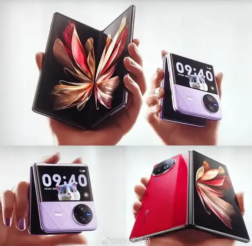
Before its official debut, leaks and tip-offs have revealed the major specifications of the upcoming Vivo X Fold 2 and X Flip. Here are some of the features and specs that have been reported by various sources
Vivo X Fold 2 Full Specifications (Rumour) Display (inner/main): 8.03-inch Samsung E6 AMOLED display with 2160×1916 pixel resolution, 120Hz refresh rate, HDR10+ support, and punch-hole cutout for selfie camera Display (outer): 6.53-inch Samsung E6 AMOLED display with 2520×1080 pixel resolution, 120Hz refresh rate, HDR10+ support Processor: Snapdragon 8 Gen 2 4nm processor with Cortex-X3 core clocked at 3.2GHz RAM and Storage: 12GB of LPDDR5X RAM and up to 512GB of UFS 4.0 storage Camera (Rear): Triple rear camera with 50MP main sensor with OIS, 12MP ultra-wide lens with 108-degree, and 12MP portrait lens Front Camera(Inner and Outer): 16MP Battery: 4800mAh with 120W wired charging and 50W wireless charging Other features: In-display ultrasonic fingerprint scanner, Zeiss optics, Zeiss T* lens coating, dual-LED flash, and stereo speakers Colours: Black, blue, and red. Vivo X Flip (Rumour Specs) Design: Clamshell flippable Display (inner/main): 6.74-inch AMOLED main display with 2520×1080 pixel resolution, 120Hz refresh rate, HDR10+ support Display (outer): 3-inch AMOLED display Processor: Snapdragon 8+ Gen 1 chipset, an upgraded version of the Snapdragon 888 chipset RAM and Storage: 12GB of LPDDR5X RAM and up to 512GB of UFS 4.0 storage Camera (Rear): Dual rear camera with 32MP main sensor with f/1.75 aperture and 12MP ultra-wide lens with 108-degree and f/2.2 aperture Front Camera: 16MP Battery: 4400mAh with 44W fast charging Other features: in-display fingerprint scanner, Zeiss optics, Zeiss T* lens coating, dual-LED flash, stereo speakers, and an argyle-like embossed design on the back Colours: Black, blue, and red These are some of the features and specs that have been leaked or rumoured about the Vivo X Fold 2 and X Flip so far. It is important to note that these are not official or confirmed by Vivo yet. Therefore, they may change or differ from the actual products that will be launched on April 20th in China.
For Full official specs and features, visit our blog – fdaytalk news – Vivo X Fold 2 and X Flip Specifications
Read More
Scroll to Top