A rebuilt Properties dialog spotted in preview builds shows Microsoft is finally touching one of File Explorer’s oldest screens.
Windows 11 has picked up a modern look in pieces over the past few years, but File Explorer’s Properties window sat untouched through all of it. That’s starting to change. Insiders sifting through recent preview builds found an early version of a redesigned Properties dialog built on WinUI 3, complete with dark mode and a layout that finally matches the rest of the app. It’s not ready for most users yet, and it points to a much bigger compatibility puzzle Microsoft still has to solve before the redesign can go wide.
Windows 11’s File Explorer Properties dialog is finally moving to WinUI 3
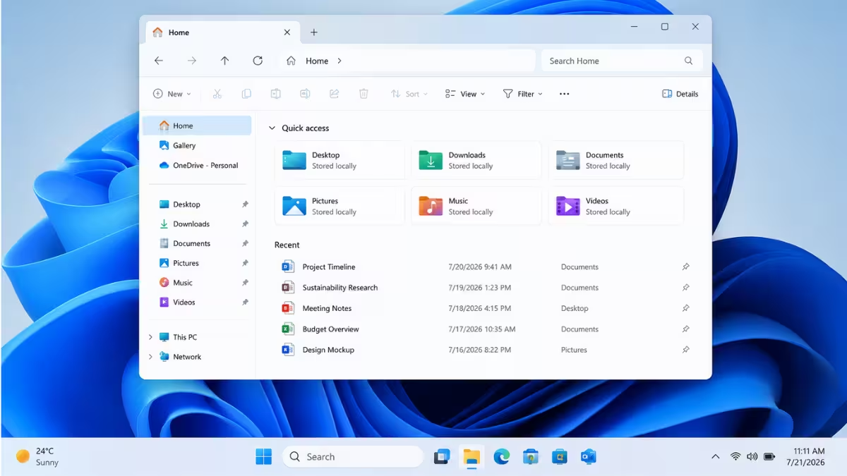
Open File Explorer today and you’re looking at two different design eras stitched together. The Home page, the top command bar, and the details pane already run on WinUI 3, Microsoft’s modern app framework. Right-click a file and hit Properties, though, and you land on a screen that has barely changed since Windows 95. No dark mode, dated checkboxes, and a layout that doesn’t match anything else in the app.
That gap is finally closing. Insiders digging through recent builds found a reworked Properties dialog built entirely on WinUI 3, with no leftover Win32 code underneath.
New Properties dialog brings dark mode and a WinUI 3 layout
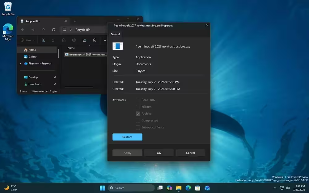
The refreshed dialog picks up a full dark mode, something the current version has never supported. Tabs now use a Pivot-style layout with an accent highlight under the active tab, buttons like Restore get the rounded accent styling seen across other WinUI 3 surfaces, and checkboxes have softer, rounded corners instead of the old square boxes.
For now, this new design only shows up in one narrow spot: checking the properties of a file sitting in the Recycle Bin. Every other Properties screen in File Explorer still loads the classic dialog, so this is clearly a very early build rather than something close to shipping.
The real reason this redesign has taken years
A simple visual refresh wouldn’t have taken this long, and the holdup comes down to compatibility, not effort. Countless installed programs, from archive tools to security software, add their own tab to the Properties window through a shell extension interface. Each of those added tabs is still built the old way, as a native Win32 page handed off to the dialog.
Swapping the entire dialog to WinUI 3 means Microsoft needs a way to keep hosting those old, unmodified tabs inside a completely new interface without breaking any of them. That’s a far bigger engineering task than restyling a window, and it’s likely why the Recycle Bin case, which has no extra tabs to juggle, is the only place the new dialog has surfaced so far.
Performance is the other piece holding things back. Parts of File Explorer that already run on WinUI 3, like the Home tab, have been criticized for opening slower than older sections of the app that skip the framework entirely. Microsoft has said it’s actively tuning WinUI 3 for speed, and getting that right matters before rolling the framework out to more of File Explorer’s legacy screens.
Windows 11’s Run dialog and other File Explorer changes are also getting updated
File Explorer’s Properties dialog isn’t an isolated project. Microsoft is also piloting a new Run box, one that finally departs from the look Run has kept since the Windows 95 days. It’s opt-in for now, sitting behind a toggle in Settings > Advanced Settings, and once switched on it still opens the usual way with Win + R. Early testing points to quicker load times than the legacy Run window, though the new version currently can’t be dragged to a different screen position.
According to Microsoft’s own Windows Insider release notes, several smaller File Explorer changes are already further along than the Properties redesign. Details view now shows file sizes in KB, MB, or GB instead of forcing everything into KB, middle-click opens folders in new tabs from the address bar and Home page, and screen reader announcements during file conflict prompts are clearer for Narrator users. None of these depend on the WinUI 3 overhaul, so they’re likely to reach general availability well before the new Properties dialog does.
When will the new Properties dialog reach Windows 11 users
Microsoft hasn’t announced a rollout timeline, and given how limited the current sighting is, a public release looks far off. The bigger unlock will be seeing the redesign extend beyond Recycle Bin files to regular files and folders, since that’s where the third-party tab compatibility work actually gets tested at scale.
Frequently Asked Questions
Is the redesigned Properties dialog available outside the Recycle Bin yet?
No. As of this build, the new WinUI 3 Properties dialog only appears when checking properties on a file inside the Recycle Bin. Every other file still opens the classic dialog.
Does the new Properties dialog support dark mode?
Yes. That’s one of the main gaps the redesign fixes, since the current Win32 dialog has never supported dark mode.
Will third-party tabs added by apps like antivirus tools still show up in the new dialog?
Microsoft hasn’t confirmed the details publicly, but the redesign depends on finding a way to keep hosting those existing shell extension tabs inside the new WinUI 3 layout without breaking them.
How do I enable the new modern Run dialog?
Turn it on from Settings > Advanced Settings, then open it the usual way with Win + R.

