);mask-image:url(data:image/svg+xml;utf8, );content:"";margin:0 .4rem;display:inline-block;vertical-align:middle;line-height:1}.breadcrumb-trail .trail-items li:last-child:after{display:none}.bloghash-breadcrumbs{font-size:1.4rem;border-width:0}#page .page-header .bloghash-breadcrumbs a>span{color:inherit}#bloghash-scroll-top{-webkit-box-align:center;-ms-flex-align:center;align-items:center;-webkit-box-pack:center;-ms-flex-pack:center;justify-content:center;position:fixed;bottom:2.5rem;right:2rem;z-index:997;width:4rem;height:4rem;opacity:0;-webkit-transform:translate3d(0,3rem,0);transform:translate3d(0,3rem,0)}#bloghash-scroll-top .bloghash-scroll-icon{overflow:hidden;z-index:2}#bloghash-scroll-top .bloghash-icon{-webkit-box-align:center;-ms-flex-align:center;align-items:center;-webkit-box-pack:center;-ms-flex-pack:center;justify-content:center;height:2rem;color:var(--bloghash-white);-webkit-transform:translateY(1.1rem);-ms-transform:translateY(1.1rem);transform:translateY(1.1rem)}#bloghash-scroll-top:before{content:"";z-index:1;border-radius:10rem;background-color:var(--bloghash-primary);-webkit-transform:scale(1);-ms-transform:scale(1);transform:scale(1);border:.1rem solid rgb(185 185 185/.4)}#bloghash-scroll-top svg{fill:var(--bloghash-white)}#main .bloghash-widget{overflow:hidden}#main .bloghash-widget{margin-bottom:4rem}.widget-title,.wp-block-search .wp-block-search__label{margin-top:0;position:relative;display:block;margin-bottom:2.5rem}.wp-block-search .wp-block-search__label{width:auto;line-height:1.4}.bloghash-entry>:first-child,.wp-block-group__inner-container>:first-child{margin-top:0}.bloghash-entry>:last-child,.wp-block-group__inner-container>:last-child{margin-bottom:0}.wp-block-group__inner-container>:first-child:last-child{margin-bottom:0}.bloghash-entry p{margin-bottom:1.5rem;margin-top:1.5rem}.bloghash-entry figure{margin-top:2rem;margin-bottom:2rem}#main .content-area .entry-meta a{color:inherit}.entry-meta{font-size:1.3rem;font-weight:600;margin-top:1.2rem}.entry-meta .bloghash-icon{height:1.827rem;margin-right:.7rem;vertical-align:text-bottom}.entry-meta .entry-meta-elements>span{padding:0 1rem;line-height:1.2}.entry-meta .entry-meta-elements>span.posted-on{line-height:1.5}.entry-meta .entry-meta-elements>span,.entry-meta .entry-meta-elements>span .posted-by{-js-display:inline-flex;display:-webkit-inline-box;display:-ms-inline-flexbox;display:inline-flex;-webkit-box-align:center;-ms-flex-align:center;align-items:center}.entry-meta .entry-meta-elements>span:first-child{padding-left:0}.entry-meta .entry-meta-elements>span:last-child{margin-right:0;padding-right:0}.entry-meta .entry-meta-elements>span:before{content:"";position:relative;left:-1.1rem;width:4px;height:4px;border-radius:100%;background-color:var(--bloghash-primary)}.entry-meta .entry-meta-elements>span:first-child:before{display:none}.single-post .entry-content{margin-top:4rem}.single .entry-content img{margin:0 auto;display:block}.single .post-category{margin-bottom:.3rem;font-size:1.4rem}.single .post-category a{-js-display:inline-flex;display:-webkit-inline-box;display:-ms-inline-flexbox;display:inline-flex;margin:0 .4rem .8rem .4rem}.single .entry-header{text-align:start;margin-bottom:1rem}.single .entry-meta{text-align:start;margin-top:1.6rem}.single .entry-content{margin-bottom:5rem}.single .entry-content>:last-child{margin-bottom:0!important}.single.bloghash-page-title-align-left .bloghash-article>.entry-header,.single.bloghash-page-title-align-left .bloghash-article>.post-category{text-align:start}.single.bloghash-page-title-align-left .bloghash-article>.entry-meta>.entry-meta-elements{-webkit-box-pack:start;-ms-flex-pack:start;justify-content:flex-start}.bloghash-has-comments-toggle #comments{display:none;margin-top:4rem}#comments{margin-top:5rem}#comments .comments-title-wrapper{margin:0 0 4rem 0}#comments .comments-title-wrapper p{text-align:center;margin-top:.6rem;font-size:1.6rem}#respond{margin-top:4rem}#respond .comment-reply-title{-webkit-box-align:center;-ms-flex-align:center;align-items:center;-webkit-box-pack:center;-ms-flex-pack:center;justify-content:center}#respond .must-log-in{text-align:center;color:#66717f;margin-top:.6rem}#cancel-comment-reply-link{font-size:1.3rem;border-radius:var(--bloghash-normal-radius);border:.2rem solid currentColor;font-weight:500;padding:.4rem .7rem;line-height:1;text-decoration:none;text-transform:capitalize;margin-left:1.4rem;color:inherit}#page .center-text{text-align:center}.bloghash-hamburger{padding:0 0;display:inline-block;font:inherit;color:inherit;text-transform:none;background-color:#fff0;border:0;margin:0;overflow:visible}.hamburger-box{width:2.5rem;height:1.4rem;display:inline-block;position:relative}.hamburger-inner{display:block;top:50%;margin-top:-.1rem}.hamburger-inner,.hamburger-inner::before,.hamburger-inner::after{width:2.8rem;height:2px;background-color:#111827;border-radius:var(--bloghash-normal-radius);position:absolute}.hamburger-inner::before,.hamburger-inner::after{content:"";display:block}.hamburger-inner::before{top:-5px}.hamburger-inner::after{bottom:-5px}.bloghash-mobile-nav{order:1;display:none;margin-left:2.4rem}.bloghash-hamburger,.bloghash-mobile-nav{-webkit-box-align:center;-ms-flex-align:center;align-items:center}body:not(.is-mobile-menu-active) .bloghash-hamburger .hamburger-box .hamburger-inner::before{width:1.5rem}.bloghash-hamburger{-js-display:inline-flex;display:-webkit-inline-box;display:-ms-inline-flexbox;display:inline-flex;border-radius:var(--bloghash-normal-radius)}.bloghash-hamburger .hamburger-inner,.bloghash-hamburger .hamburger-inner::before,.bloghash-hamburger .hamburger-inner::after{background-color:currentColor}#bloghash-header:after{content:"";position:fixed;top:100%;left:0;right:0;height:100vh;background-color:rgb(255 255 255/.85);z-index:991;opacity:0;visibility:hidden;will-change:opacity,visibility;-webkit-transform:translate3d(0,0,0);transform:translate3d(0,0,0)}@media only screen and (max-width:868px){.bloghash-container{padding:0 3rem}.bloghash-mobile-nav{margin-left:1.6rem}}@media only screen and (max-width:599px){.bloghash-header-element{position:static}.page-header>.bloghash-container{-webkit-box-align:start;-ms-flex-align:start;align-items:flex-start;-webkit-box-orient:vertical;-webkit-box-direction:normal;-ms-flex-direction:column;flex-direction:column}}@media only screen and (max-width:480px){#page{min-height:-webkit-fill-available}}@media only screen and (max-width:960px){#main>.bloghash-container{display:block}#primary{max-width:100%!important;padding-left:0!important;padding-right:0!important;margin-top:4rem}.site-main #secondary{width:100%;margin-top:4rem}}@media all and (-ms-high-contrast:none),(-ms-high-contrast:active){#main>.bloghash-container #primary{-ms-flex-preferred-size:0%;flex-basis:0%}}.content-area a:not(.bloghash-btn,.wp-block-button__link,.page-numbers,[class^="cat-"],[rel="tag"]){color:var(--bloghash-primary)}.bloghash-nav>ul .sub-menu::after{border-bottom-color:var(--bloghash-primary);outline:none!important}.bloghash-nav .sub-menu{border-top-color:var(--bloghash-primary)}::-webkit-selection{background-color:var(--bloghash-primary);color:var(--bloghash-white)}::-webkit-scrollbar-thumb{background:rgb(0 0 0/.2)}::-webkit-scrollbar-thumb:hover{background:rgb(0 0 0/.4)}@media (prefers-reduced-motion:reduce){*{animation-duration:0s!important}}.bloghash-glassmorphism{position:fixed;right:0;left:0;bottom:0;display:flex;overflow:hidden;z-index:-1}.bloghash-glassmorphism .block{width:28.8rem;height:28.8rem;filter:blur(64px);mix-blend-mode:multiply;border-radius:999px;display:block;opacity:.1}.bloghash-glassmorphism .block.one{margin-top:5rem;background-color:#ef233c}.bloghash-glassmorphism .block.two{margin-top:16rem;margin-left:-8rem;background-color:#04868b}@media only screen and (min-width:768px){.bloghash-glassmorphism{top:4rem}}@media only screen and (min-width:1024px){.bloghash-glassmorphism .block{width:38.4rem;height:38.4rem}}@media only screen and (min-width:1280px){.bloghash-glassmorphism{top:8rem}}.wp-block-image:not(.alignfull,.is-style-rounded) img{border-radius:calc(var(--bloghash-radius) - 1.2rem);overflow:hidden}.post-category .cat-links a.cat-12399{--bloghash-primary:#F43676;--bloghash-primary_80:#fdd7e4}:root{--bloghash-primary:#F43676;--bloghash-primary_80:#fdd7e4;--bloghash-primary_15:#f6558b;--bloghash-primary_27:rgba(244,54,118,0.27);--bloghash-primary_10:rgba(244,54,118,0.1)}#bloghash-header-inner{background:#FFF}.bloghash-logo .site-description{color:#66717f}#bloghash-header,.bloghash-logo a,.bloghash-hamburger{color:#131315}#bloghash-header-inner{border-color:rgb(185 185 185/.4);border-bottom-width:1px}@media screen and (max-width:960px){#bloghash-header-inner .bloghash-nav{display:none;color:#000}.bloghash-mobile-toggen,.bloghash-mobile-nav{display:inline-flex}#bloghash-header-inner{position:relative}#bloghash-header-inner .bloghash-nav>ul>li>a{color:inherit}#bloghash-header-inner .site-navigation{display:none;position:absolute;top:100%;width:100%;height:100%;min-height:100vh;left:0;right:0;margin:-1px 0 0;background:#FFF;border-top:1px solid #eaeaea;box-shadow:0 15px 25px -10px rgb(50 52 54/.125);z-index:999;font-size:1.7rem;padding:0}#bloghash-header-inner .site-navigation>ul{overflow-y:auto;max-height:68vh;display:block}#bloghash-header-inner .site-navigation>ul>li>a{padding:0!important}#bloghash-header-inner .site-navigation>ul li{display:block;width:100%;padding:0;margin:0;margin-left:0!important}#bloghash-header-inner .site-navigation>ul .sub-menu{position:static;display:none;border:none;box-shadow:none;border:0;opacity:1;visibility:visible;font-size:1.7rem;transform:none;background:#f8f8f8;min-width:initial;left:0;padding:0;margin:0;border-radius:0;line-height:inherit}#bloghash-header-inner .site-navigation>ul .sub-menu>li>a>span{padding-left:50px!important}#bloghash-header-inner .site-navigation>ul .sub-menu a>span{padding:10px 30px 10px 50px}#bloghash-header-inner .site-navigation>ul a{padding:0;position:relative;background:none}#bloghash-header-inner .site-navigation>ul li{border-bottom:1px solid #eaeaea}#bloghash-header-inner .site-navigation>ul>li:last-child{border-bottom:0}#bloghash-header-inner .site-navigation>ul a>span{padding:10px 30px!important;width:100%;display:block}#bloghash-header-inner .site-navigation>ul a>span::after,#bloghash-header-inner .site-navigation>ul a>span::before{display:none!important}#bloghash-header-inner .site-navigation>ul .menu-item-has-children>a{display:inline-flex;width:100%;max-width:calc(100% - 50px)}#bloghash-header-inner .bloghash-nav .menu-item-has-children>a>span{border-right:1px solid rgb(185 185 185/.4)}#bloghash-header-inner .bloghash-nav .menu-item-has-children>a>.bloghash-icon{transform:none;width:50px;margin:0;position:absolute;right:0;height:1em;display:none}.bloghash-mobile-toggen{width:50px;height:1em;background:none;border:none}.bloghash-mobile-toggen .bloghash-icon{transform:none;width:50px;margin:0;position:absolute;right:0;height:1em}}.bloghash-nav.bloghash-header-element,.bloghash-header-layout-1 .bloghash-header-widgets{font-weight:600;font-family:"Inter Tight",Helvetica,Arial,sans-serif;font-size:1.7rem;line-height:1.5}#secondary{width:30%}body:not(.bloghash-no-sidebar) #primary{max-width:70%}.bloghash-layout__boxed-separated #comments,.bloghash-layout__boxed-separated #content>article,.bloghash-layout__boxed-separated.bloghash-sidebar-style-2 #secondary .bloghash-widget{background-color:#FFF}body{color:#002050}#comments .no-comments{color:#002050}h1,h3,.h4,a,.entry-meta,.bloghash-logo .site-title,.wp-block-search__label{color:#302D55}:root{--bloghash-secondary:#302D55}.bloghash-container{max-width:1480px}.bloghash-logo .logo-inner{margin-top:27px;margin-right:10px;margin-bottom:27px;margin-left:10px}@media only screen and (max-width:768px){.bloghash-logo .logo-inner{margin-top:25px;margin-right:1px;margin-bottom:25px}}.page-header{background:rgb(244 54 118/.1)}.page-header{border-color:rgb(0 0 0/.062);border-style:solid;border-bottom-width:1px}.bloghash-breadcrumbs{padding-top:15px;padding-bottom:15px}html{font-size:62.5%}@media only screen and (max-width:768px){html{font-size:53%}}@media only screen and (max-width:480px){html{font-size:50%}}*{-moz-osx-font-smoothing:grayscale;-webkit-font-smoothing:antialiased}body{font-weight:400;font-family:"Be Vietnam Pro",Helvetica,Arial,sans-serif;font-size:1.7rem;line-height:1.75}h1,.bloghash-logo .site-title,h3,.h4{font-weight:700;font-style:normal;text-transform:none;text-decoration:none;font-family:"Be Vietnam Pro",Helvetica,Arial,sans-serif}h1,.bloghash-logo .site-title{font-weight:700;font-size:4rem;line-height:1.4}h3{font-weight:700;font-size:2.8rem;line-height:1.4}.h4{font-weight:700;font-size:2.4rem;line-height:1.4}h3 em{font-style:italic;font-family:"Playfair Display",Georgia,serif}h3 em{font-style:italic;font-family:"Playfair Display",Georgia,serif}#bloghash-header .bloghash-logo .site-title{font-size:3rem}#main .widget-title,#secondary .bloghash-widget .wp-block-search__label{font-size:2.4rem}.single-post .entry-content{font-size:1.6rem}.wp-block-jetpack-top-posts{margin-bottom:1.5em}.wp-block-jetpack-top-posts span{display:block;word-wrap:break-word}.wp-block-jetpack-top-posts.is-list-layout .jetpack-top-posts-item{margin-bottom:1.5em}
Oppo Find N3 leaks reveal display and camera features
Skip to content Oppo is gearing up to launch its latest flagship device, Oppo Find N3, which is expected to be a next-gen foldable smartphone . The latest leak about its display and camera features came from a tipster Digital Chat Station user on Weibo .
According to leaked specs, the Oppo Find N3 will have a 7.82-inch primary display and a 6.31-inch secondary display, both of which will be AMOLED and support a 120Hz refresh rate. The primary display will have a resolution of 2268 x 2440 pixels, while the secondary display will have a resolution of 1080 x 2400 pixels.
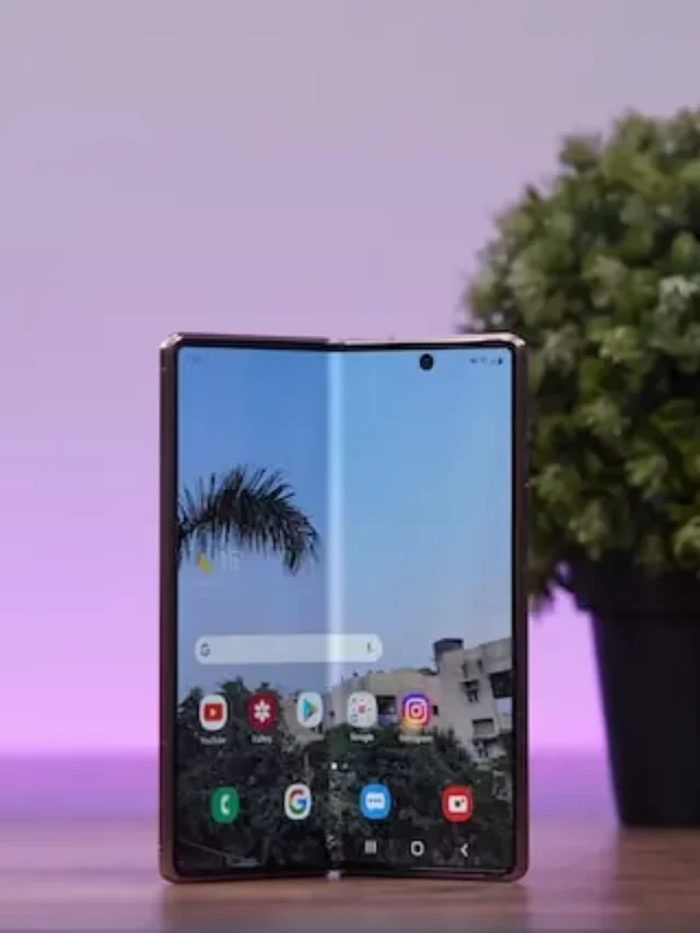
The Oppo Find N3 is rumored to have triple rear camera on back, consisting of a 50MP Sony IMX890 main sensor with OIS, a 48MP Sony IMX581 ultra-wide sensor, and a 64MP OmniVision OV64B periscope zoom sensor that can offer up to 3x optical zoom. The front-facing camera will be 32MP on the secondary display and 20MP on the primary display.
The Oppo Find N3 is expected to be powered by the Snapdragon 8 Gen 2 chipset and 12GB RAM. The phone will also have a 4,800mAh battery that supports fast charging.
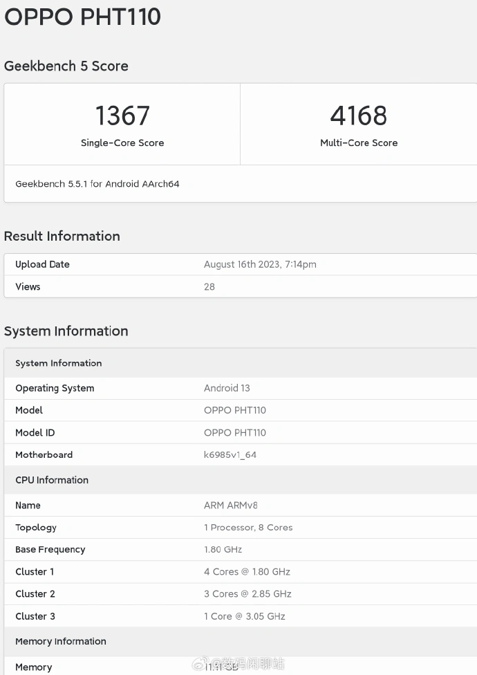
Oppo Find N3 Specifications (Rumoured) Display:Primary display: 7.82-inch AMOLED, 2268 x 2440 pixels, 120Hz refresh rate Secondary display: 6.31-inch AMOLED, 1080 x 2400 pixels, 120Hz refresh rate Camera:Rear camera: 50MP + 48MP + 64MP Front camera: 32MP+20MP Processor: Snapdragon 8 Gen 2 chipset Battery: 4800mAh with fast charging support Price and availability The Oppo Find N3 is expected to launch in China later this month and globally in September. It is set to compete with other foldable smartphones like Samsung Galaxy Z Fold 3. The Oppo Find N3 is likely to offer a premium design and great user experience with its innovative display and camera features. The price and availability of the phone are yet to be announced by Oppo.
Source: via
Read More
Scroll to Top